Brief:
With the worldwide pandemic of Covid-19, many businesses were forced to shut down as no end was in sight.
CM Carpentry Services took this time to review the business strategically. With solid ambitions for survival and a vast skill set behind them, including a loyal customer base, they set the brief as "Let's utilise this time to build our strength so that when business resumes, we'll be fully prepared and better than ever!"
Creative:
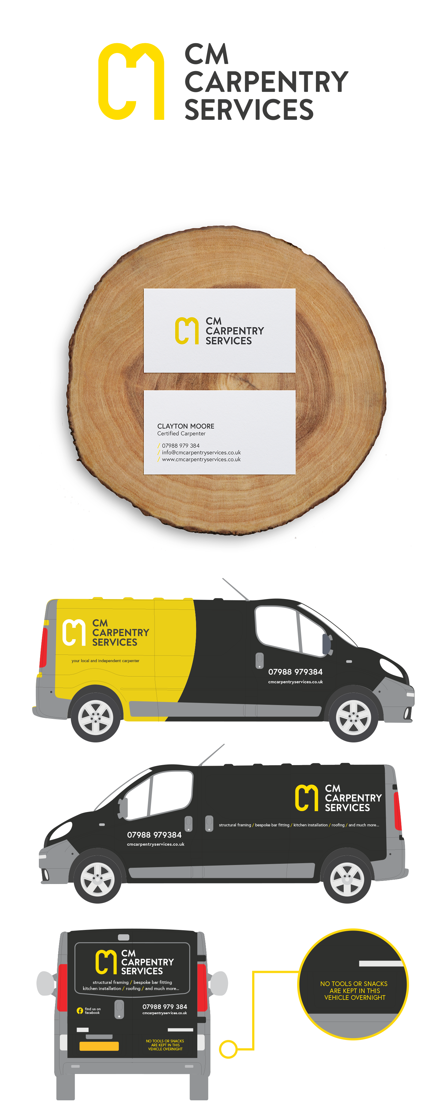
Previously, the brand relied solely on business cards to secure work. However, the recent brand refresh and open growth ambition gave opportunities in both print and digital.
The brand has expanded its presence across various channels, including business cards, social media, website, flyers, quotes, invoices, uniforms, stationery, and even considering COVID-19-related considerations. Additionally, the brand has ventured into Google ads and fleet branding.
The central goal is to be visible and heard from all angles, adopting a comprehensive approach to building the business and ensuring its survival in the current challenging economic climate.
Logo:
Given that the original logo was designed in 2014, it was essential to update it to align with the present state of the business and its future trajectory.
The original logo was constructed as my Final Major Project during my third and final year at University. Now, armed with an additional five years of experience, we decided to preserve the core elements of the locally recognised logo while giving it a subtle update.
As we began the process of updating the logo, we opted for a subtle change in the font style, ultimately transforming it into a capital case version. This modification increased readability and stronger recognition from afar (or on a moving vehicle).
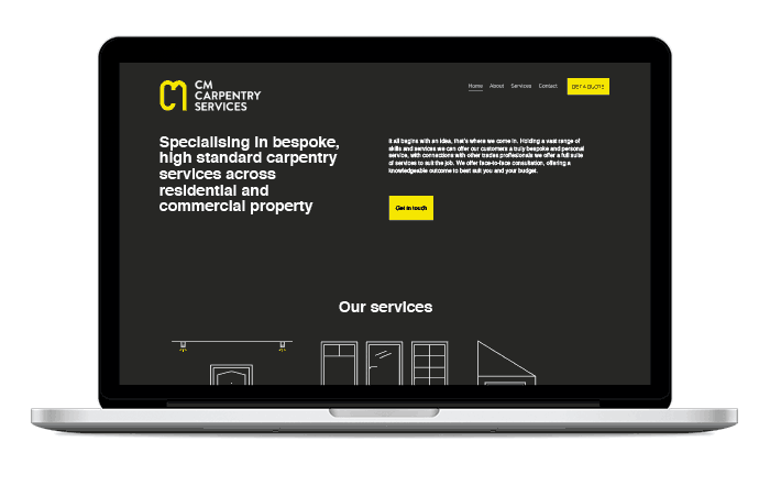
Website:
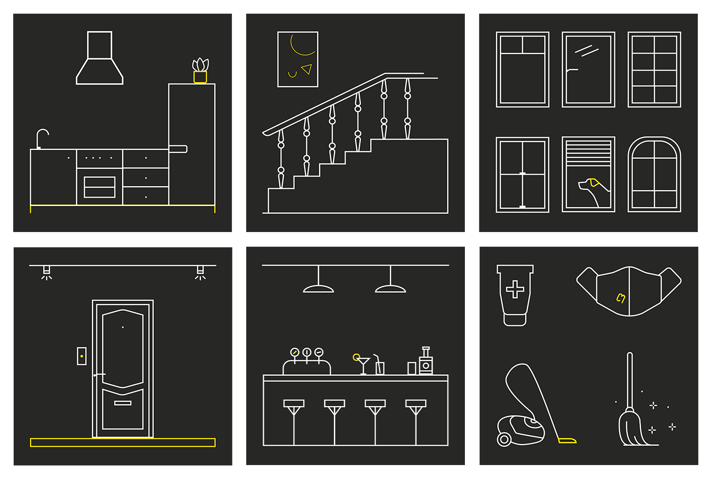
In addition to logo, we focused on educating our customers and offering easily digestible information. For this purpose, a website was designed with supporting subtle illustrations instead of showcasing services with photos that tend to age over time.
By employing this approach, we aimed to provide our customers with a timeless and informative online experience, avoiding the pitfalls of relying solely on photographs while still conveying the essence of our available services. Each illustration I created from sketches was custom-made - to ensure each illustration is considered and branded, I implemented a subtle touch of detail using the brand's core colour (yellow) - can you see the details?
Did you see the original branding: CM Carpentry Services