

CM Carpentry Services was my final major project in my third year of University. The carpentry company provides a wide range of services to residential, commercial and industrial properties.
Self-initiated Brief:
Develop a complete set of branding materials to elevate CM Carpentry Services' presence among local customers and establish a distinct brand image that sets them apart from competitors. Avoid cliché branding visuals; the aim is to position CM Carpentry Services above others, capturing the attention of their target audience.Creative:
Logo:
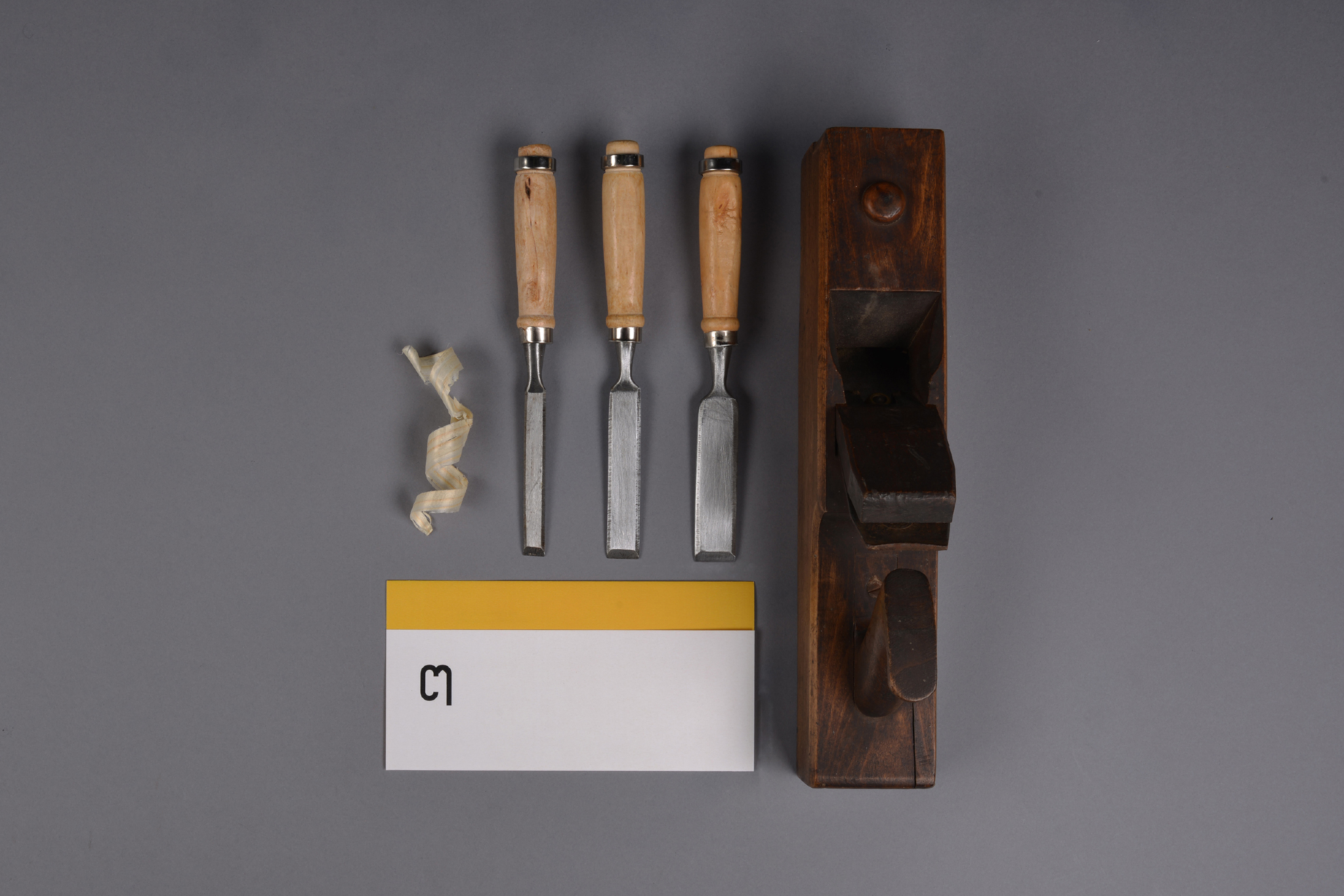
I wanted to revive and reawaken how trades are branded, avoiding cliches such as clip art and using tools to show the company. The logo is created on circular and angular shapes, defined to form an abstract view of the initials CM.
The visual:
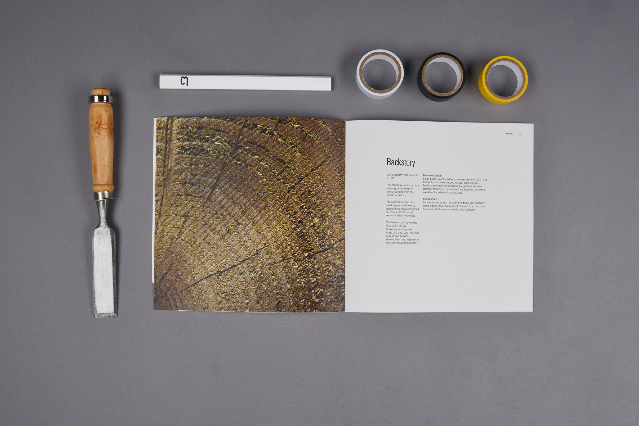
Carpentry is a meticulous and intricate trade; this inspired me to craft an identity that celebrates the connection between design and the company's skillset.
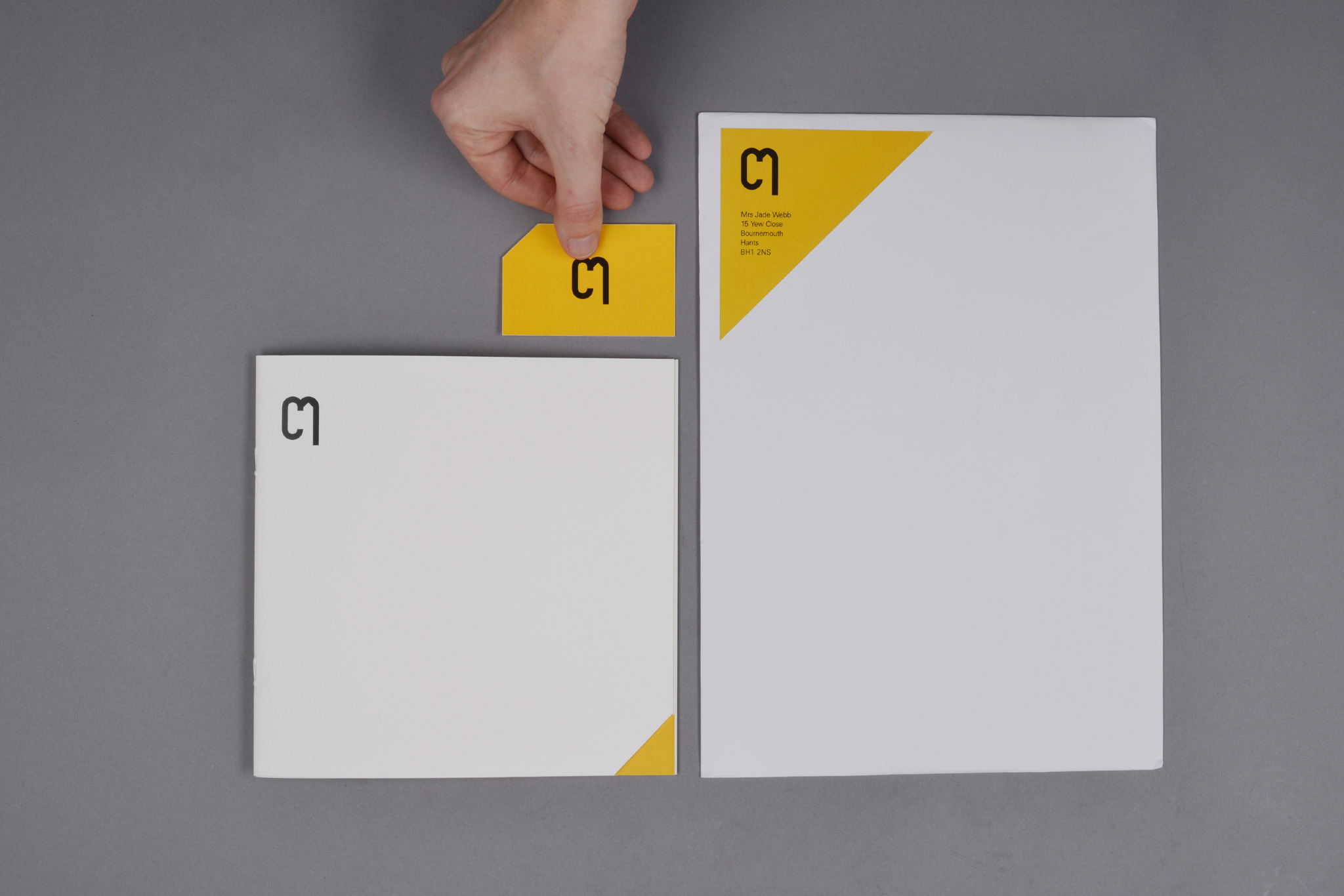
I aimed to create a unified brand image with subtle details that complemented the company's expertise. The angular cuts on the edges of the printed materials serve as a contrasting colour device, appearing consistently across the brand to accentuate its angular elements. This not only establishes a clean contrast with the colour palette but also adds a dimensional and intricate touch.
Colour:
The branding of the company features an intriguing shade of yellow carefully selected to harmonize with the buds that form on the Oaktree. This deliberate choice serves a dual purpose: firstly, it sets the company apart from its competitors, ensuring a distinctive and memorable identity. Secondly, it subtly conveys the hidden concept of 'resourcing from nature'.
2020 refresh:
View CM Carpentry Services 2020